

Why your typeface matters more than your logo
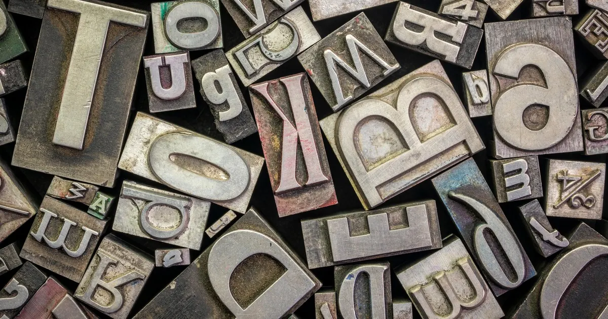
Look at any website you have paid for. The logo appears once, usually in the top left, usually smaller than anything else in the header. Then look at everything else on the page. All of it is set in a typeface, and that typeface is doing the work of telling the reader who you are, over and over, for as long as they stay.
We spend weeks on the mark and minutes on the type. It is the wrong way round.
The website typeface is the brand, most of the time
A mark is a signature. It confirms identity for someone who already arrived. It is not doing persuasion, because nobody has ever read a paragraph and thought better of the company because the logo in the corner was well drawn.
The website typeface is different. It sets the headline that decides whether anyone scrolls. It sets the capability list, the specification table, the price, the button, the fine print at the bottom that says who you are legally. Every single word a visitor reads passes through it, which makes it the highest-frequency brand decision on the page and, in most projects, the one made fastest.
You can test this. Take a company you rate and set their site in a default system font. Nothing else changes, the logo is untouched. It reads instantly cheaper. Then take a weak logo and set the same page in type chosen properly, with real hierarchy. It reads like a serious business with a dated mark, which is a far better problem to have.
What a typeface actually has to survive
Most type gets chosen in a specimen: a beautiful word at a large size on a white background, in the two weights the designer liked. Then it goes into a site that has none of those conditions.
Judge a face in the worst conditions your pages will actually contain. A dense paragraph at body size on a phone. Your longest product or service name in a navigation item. A phone number, a UEN, an address. A specification table with numbers that need to line up. A legal disclaimer nobody wants to read but everyone has to be able to.
If it survives all of that, it is a text face and it can carry a website. If it only works large and short, it is a display face, and a display face carrying body copy is exactly what makes a site look tired three years after launch.
The other test is hierarchy. You need enough weights and enough contrast between them to build a page without reaching for colour every time something needs emphasis. Weight contrast is quieter than colour and ages better. On Towa Marine, the decision that mattered was that availability and reach sit above company history. That is a hierarchy decision before it is a design one, and hierarchy is executed in type.
What does web font licensing actually require?
This is the part that gets skipped, and it is the part with legal consequences.
Web fonts are licensed separately from desktop fonts. A desktop licence covering your designer’s laptop does not cover serving the same file to visitors, because the font now sits on a web server rather than a workstation. Two things then matter: how the file is delivered, and how much traffic it serves.
Self-hosting is the technical default now. You serve the font files from your own domain. Browser support is not the constraint it once was, with the modern web font format supported by more than 96 per cent of tracked global traffic according to Can I Use. The constraint is legal, not technical.
Open licences are permissive, but they are not “do anything”. The most common one is the SIL Open Font License, currently Version 1.1, which has sat unchanged at that version for nearly 20 years. It grants the right to use, study, modify and redistribute, including commercially. Its conditions are short and worth reading in full. The font software may not be sold by itself. Copies redistributed with anything must carry the copyright notice and the licence, as a stand-alone text file, a human-readable header, or machine-readable metadata a user can view. A modified version may not use a reserved font name without written permission. That last pair catches more people than you would expect, because subsetting and renaming font files is exactly what a build pipeline does automatically, and stripping the notice while doing it is the default behaviour of a lot of tooling.
Retail licences are usually metered. Foundries price web use by traffic and by domain, and the numbers vary widely. Parachute sells a basic web licence covering a monthly maximum of 50,000 pageviews, as an annual licence, with an upgrade required if you exceed it. TypeTogether sells perpetual licences starting at an average of 100,000 pageviews a month, up to unlimited. Neither approach is better. They are different bets on whether your traffic grows.
Metering is also per medium, not per company. The same Parachute page prices digital advertising as a separate licence capped at 1 million impressions. So if the campaign uses the brand face, that is a second decision, not a courtesy extension of the first.
The practical rule is unglamorous. Establish the licence terms during scoping, in writing, before anyone designs a page around a face you cannot legally serve. Retrofitting a typeface after a build is not a swap. It is a re-layout, because line lengths, heights and weights all move.
What this means for a budget
Type is one of the cheapest places to buy real quality. A licence is a small line next to design and build, and it affects every page forever, which is a better return than almost anything else you can add to a scope. Our bands and what moves them are published, and licensing sits inside them rather than appearing later as a surprise.
What we will not do is hand you a list of three typefaces to pick from. Any list published today reads as dated by the time it matters, and a face that suits a marine engineering firm selling into Northern Europe is not the one that suits a design-led consumer brand in the same city. The face follows the job.
So: fewer hours arguing about the mark, more on the thing setting every word around it. The logo will be looked at once. The type will be read all day.